Thursday, December 4, 2014
Apply geographic functions in SAP Lumira to enhance your data visualization capability
This video below is showing the method to use geo-chart in SAP Lumira to display KPI in different locations. It is useful and functions well. Enjoy it.
Build your WebI report on BEx query.
Build your WebI report upon SAP Bex query
In this post, the video below will show you the method to build your WebI report upon your BEx query. Enjoy it.
Step 1: Log on to the BI LaunchPad, create a new WebI report and select BEX query as data source:


Note: Add filters in query panel to get better performance instead of adding filters in report although in our case we do not have filters needed.
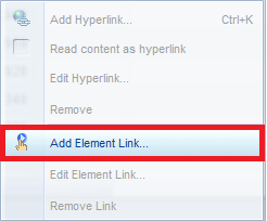
Step 4: Drag and drop the required objects to the body of the report, right click the edge of the left table (sales rep table) and add a drill down link to the sold-to-party table:


In this post, the video below will show you the method to build your WebI report upon your BEx query. Enjoy it.
Step by step description of the above video:
The purpose of this essay is to explain the method to explain in detail how to build WebI report on Bex query.
Step 1: Log on to the BI LaunchPad, create a new WebI report and select BEX query as data source:
Step 2: Select the BICS connection and query to be used
Step 3: Set variables and filters and drag and drop required objects to “Result Object” panel. Click “Run Query” button on the top right corner.
Note: Add filters in query panel to get better performance instead of adding filters in report although in our case we do not have filters needed.
Step 4: Drag and drop the required objects to the body of the report, right click the edge of the left table (sales rep table) and add a drill down link to the sold-to-party table:
Click through to the final page and choose the tables that will be connected to the left table, then click “Finish”:

Now we have built the drill down connection between the 2 parts. We can simply click any sales representative at left and see his/her customers and transactions accordingly in detail.
Step 5: Overall result comes to the top of the report so that the report viewer can easily find out the aggregated result of each object.
Note: if one column contains null values, we could use this formula and get rid of those null values:
And also if there is any requirements on data format, we could also include the requirements to our formula:
There is an easy way to do zero suppression in “format table” tab:
Step 6: Make sure that the “refresh on open” option is checked so that the report will be refreshed every time it opens.
Step 7: Adjust the format of numbers and header to make it look good.
Friday, June 20, 2014
SAP Sapphire Exhibitor 2014
Congratulation to ATCG Sales Team Victoria Ryzhova, Victor Ayers, Maria Wei and Hong Wu for helping ATCG Solutions achieve a extremely successful SAP Conference this year.
ATCG Solutions was exhibited among other consulting companies such as IBM, Accenture, PWC, Deloitte, and E&Y. The sales team made excellent progress during the conference with solid leads and sales contracts. We are very excited and optimistic influx of our sales pipeline in the next couple quarter.
Special Thanks Tengran Liu for supporting ATCG Operation during the conference. Congratulation ATCG Sales Team! Job well done! Here are the pictures and documentation we presented at SAP Sapphire Conference.
Tuesday, May 6, 2014
Drive Safely and Visualize Happliy - A Visualization Showcase on ATCG's AEES Solution
Post by ATCG BI Team
Hong Wu et al
It's been a while since our last update. Our guys are being busy with wonderful projects like SAP HANA on BW, implementation of BI platform 4.1 etc. Don't be jealous.
Also, the ATCG Team is heading to the SAPPHIRE this year! Hope we can see you guys there.
Today, what you are about to experience is a journey by using Data Visualization over effective data model to bring out insights from large data sets. Yeah, visualizing the data the a headache.
Summary
It is always a dilemma for small/mid-size companies to choose right BI Solutions over cost and efficiency. Constrained by their business scale, it is not possible for them to adopt large BI platforms not only because of the tremendous amount of upfront cost but also the long implementation lifecycle. Today, we are introducing ATCG's light, rapid BI Solution called - AEES (ATCG Enterprise ERP System). It can also seamlessly integrate with all major BI front-end tools like: SAP Lumira, Predictive Analysis, Qilkview, Tableau etc.
Scenario
AEES in a Nutshell - A light, rapid ERP solutions for small/mid-size companies.
Link to the whitepaper.
Annual traffic data release by official authority is extremely important for insurance companies to monitor and respond to the market.
Link to the whitepaper.
Annual traffic data release by official authority is extremely important for insurance companies to monitor and respond to the market.
An insurance company just acquired large dataset on US car
crash 2011, however it is a monster table with 70000+ records, Excel hangs
every time when Analyst tries to “Pivot table” it, yeah, you bet! Pivot table -
old school data analysis techniques.
Then the company turns to ATCG Solutions for help. ATCG BI
Team loaded this big chunk of raw data into AEES, and contracture them into
three major business areas (also for most organizations): HR, Finance, and
Service Operation. It is a process to make the raw data “juicy” in a rapid and
affordable way compared to those heavy-weight solutions like S.. and Ora… (You
know what I’m talking about). But, it doesn’t stop there, it is needless to say
Mobility and Self-BI is the trend. To achieve this, ATCG BI Team helped the
company to design a semantic layer which is tailored into their needs. Last but
not least, with SAP’s cut-edge visualization tool – Lumira, now the Analyst can
enjoy the BI on the fly, yeah also that grande vanilla latte on the desk.
Showcase
Source Data
Name of Dataset: us_car_crash_data_2011.xlsx (72310 records
in total)
Source: The dataset is collection of data about people
involved in car accidents with fatalities, the final injuries, alcohol/drugs
tests, and other relevant data about the accident and the person. ** Original
Source ** Fatality Analysis Reporting System (FARS) Encyclopedia http://www-fars.nhtsa.dot.gov

Figure 1
Snapshot of the dataset
How Monster Table got visualized

Analysis Scenario

The Analyst starting a bird view of car crash statistics by State, since he/she is mainly working for the western coast region, the size of the bubble from California obviously draws attention. As following, a trend analysis is being ran to tell the distribution over the month by gender:

By looking at this visualization, both Genders share the same tendency, but we do see car crash reaches the peak in July and followed by an increase till November. Thus the Analyst narrow down the time-frame to continue explore the information.

Naturally, we will think poor road conditions and weather
conditions will cause more traffic accidents. However, this visualization
reveals that car crashes happened most in urban area under clear weather. In
this case, you can’t trust your gut feeling. To keep digging into the dataset,
Analyst adds more key elements like age, fatality into the visualization and it
ends up like this beautiful bubble charts like below:

Eventually, the story has been told. Driving carefully if you were a 22-year-old person who are driving in urban area under clear weather in California!!!
What it means to the insurance company, it brings out the
key information that will help them to prepare the peak of the insurance claim
in July, and set up different evaluations for customers, cases that fall into
those categories.
Numbers don’t lie.
Happy Visualizing!
For more information regarding AEES or any BI solutions please feel free to contact:
info@ATCGSolutions.com
Subscribe to:
Posts (Atom)